Create a Page Builder in Sanity for Next js 13 (App dir)
Minh-Tri Le on May 14, 2023
If you're coming from WordPress custom themes you'll be familiar with ACF Flexible Content.
I've been using Sanity recently and its highly customisable setup lends itself nicely to this pattern.
Example Repo
Since this guide is a whole load of code snippets, I've prepared a complete working repo for a Page Builder in Sanity and Nextjs.
It is not intended to be a fully complete website starter, just a working demo of specifically what we're looking at in this article.
Firstly, please read through readme guide to clone and run project on your local.
Next js 13 support
Recently I decided migration my work to Next js 13 and support for
app dir, can check my work here: migration to Next js 13Setup Sanity
Our Page Builder is a number of Arrays of Objects connect together. Because of the way we need to define each one - that is, register the Page Builder itself and each 'block' as its own type:
First, we'll add our
page document schema to hold Page content. Page content in for tutorial is quite simple with 3 field Title, Slug and Page buider./sanityschemas/Content/Page.ts
export default {
    name: 'pages',
    type: 'document',
    title: 'Pages',
    fields: [
      {
        name: 'title',
        type: 'string',
        title: 'Title'
      },
      {
        name: 'slug',
        type: 'slug',
        title: 'Slug',
        options:{
          source: 'title',
        }
      },
      {
        name: "pageBuilder",
        type: "array",
        title: "Page Builder",
        of: [{type: 'hero'},{type: 'feature'},{type:'testimonials'}]
      },
    ],
  }
As you can see
pageBuilder field is array type with 3 block inside is hero, feature and testimonial.Now we'll actually need to create an block for field pageBuilder. Let's setup
hero.ts as an object type so that can be reused elsewhere in our schema if we need it. We’ll add fields for heading, description, and an image.Hero block:
/sanity/schemas/Blocks/Hero.ts
export default {
    name: 'hero',
    type: 'object',
    title: 'Hero',
    fields:[
        {
            name: 'title',
            type: 'string',
            title: 'Title'
        },
        {
            name: 'description',
            type: 'string',
            title: 'Hero description'
        },
        {
            name: 'heroImage',
            type: 'image',
            title: 'Hero image'
        },
    ]
}
Feature block:
/sanity/schemas/Blocks/Feature.ts
export default {
  name: 'feature',
  type: 'object',
  title: 'Feature',
  fields: [
    {
      name: 'heading',
      type: 'string',
      title: 'Heading',
    },
    {
      name: 'description',
      type: 'string',
      title: 'Feature description',
    },
    {
      name: 'featureItems',
      type: 'array',
      title: 'Feature items',
      of: [
        { type: 'item'}
      ],
    },
  ],
}
Testimonials block:
/sanity/schemas/Blocks/Testimonials.ts
export default {
    name: 'testimonials',
    type: 'object',
    title: 'Testimonials',
    fields:[
        {
            name: 'summary',
            type: 'text',
            title: 'Summary'
        },
        {
            name: 'name',
            type: 'string',
            title: 'Name'
        },
        {
            name: 'position',
            type: 'string',
            title: 'Position'
        },
        {
            name:'avatar',
            type:'image',
            title:'Avatar',
        }
    ]
}
Inside Feature block you can see we have another Array field hold object is
item, this is field to hold data for feature repeater. Again we create a item block to reuseable inside Feature block.FeatureItem:
/sanity/schemas/Shared/FeatureItem.ts
   export default {
    name: 'item',
    type: 'object',
    title: 'Item',
    fields: [
      {
        name: 'title',
        type: 'string',
        title: 'Title',
      },
      {
        name: 'description',
        type: 'string',
        title: 'Description',
      },
    ],
  }
Lastly we need to make Sanity aware of everything we've just done. Like all custom field 'types' you'll need to register all them inside your schema config.
/sanity/schemas/index.ts
import { SchemaTypeDefinition,defineField, defineType } from 'sanity'
import Pages from "./Content/Page"
import Hero from './Blocks/Hero'
import Feature from './Blocks/Feature'
import Testimonials from './Blocks/Testimonials'
import FeatureItem from './Shared/FeatureItem'

export const schema: { types: SchemaTypeDefinition[] } = {
  types: [Pages, Hero,Feature,Testimonials,FeatureItem],
}
Phew!
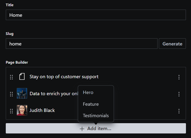
All going well we've now got a Page document in our Sanity Studio, and a Page Builder Array which can include a Content block. Like this! Add 3 components to Page builder and create some content to display on front-end later.
Setup Next js
In your main project folder, run:
yarn dev and you can access to see if Next js app run success at: http://localhost:3000/Here's the magic, dynamically loading React components from the pageBuilder array!
We create a
<PageBuilder /> component, and a component for each Block.The top level component maps over the 'blocks' in our array, and selectively load the correct component based on the _type in our query. It will also pass along the
...rest props for this specific block.Page builder component:
/components/PageBuilder.tsx
import dynamic from 'next/dynamic'

const HeroBlock = dynamic(() => import('./Hero'), { ssr: true })
const Feature = dynamic(() => import('./Feature'), { ssr: true })
const Testimonial = dynamic(() => import('./Testimonial'), { ssr: true })

export default function PageBuilder({ blocks }) {
 return blocks.map(({ _type,_key, ...rest }) => {
    if(!blocks) return null
    let Block
    switch (_type) {
      case 'hero': {
        Block = HeroBlock
        break
      }
      case 'feature': {
        Block = Feature
        break
      }
      case 'testimonials': {
        Block = Testimonial
        break
      }
    }
    return <Block {...rest} key={_key}/>
  })
}
To make this work you'll still need your components for each block. Here's our overly simplified
<Hero /> component. You should to create another components <Feature /> and <Testimonial /> too.Hero component:
/components/Hero.tsx
export default function Hero({ title, description}) {
return (
<div className="relative bg-white m-5 rounded-lg overflow-hidden">
<div className="mx-auto lg:grid lg:grid-cols-12 lg:gap-x-8 lg:px-8">
<div className="px-6 pb-24 pt-10 sm:pb-32 lg:col-span-7 lg:px-0 lg:pb-56 lg:pt-48 xl:col-span-6">
<div className="mx-auto max-w-2xl lg:mx-0">
<img
className="h-11"
src="https://tailwindui.com/img/logos/mark.svg?color=indigo&shade=600"
alt="Your Company"
/>
<div className="hidden sm:mt-32 sm:flex lg:mt-16">
<div className="relative rounded-full px-3 py-1 text-sm leading-6 text-gray-500 ring-1 ring-gray-900/10 hover:ring-gray-900/20">
Anim aute id magna aliqua ad ad non deserunt sunt.{' '}
<a href="#" className="whitespace-nowrap font-semibold text-indigo-600">
<span className="absolute inset-0" aria-hidden="true" />
Read more <span aria-hidden="true">→</span>
</a>
</div>
</div>
<h1 className="mt-24 text-4xl font-bold tracking-tight text-gray-900 sm:mt-10 sm:text-6xl">
{title}
</h1>
<p className="mt-6 text-lg leading-8 text-gray-600">
{description}
</p>
<div className="mt-10 flex items-center gap-x-6">
<a
href="#"
className="rounded-md bg-indigo-600 px-3.5 py-2.5 text-sm font-semibold text-white shadow-sm hover:bg-indigo-500 focus-visible:outline focus-visible:outline-2 focus-visible:outline-offset-2 focus-visible:outline-indigo-600"
>
Get started
</a>
<a href="#" className="text-sm font-semibold leading-6 text-gray-900">
Learn more <span aria-hidden="true">→</span>
</a>
</div>
</div>
</div>
<div className="relative lg:col-span-5 lg:-mr-8 xl:absolute xl:inset-0 xl:left-1/2 xl:mr-0">
<img
className="aspect-[3/2] w-full bg-gray-50 object-cover lg:absolute lg:inset-0 lg:aspect-auto lg:h-full"
src="https://images.unsplash.com/photo-1498758536662-35b82cd15e29?ixlib=rb-4.0.3&ixid=MnwxMjA3fDB8MHxwaG90by1wYWdlfHx8fGVufDB8fHx8&auto=format&fit=crop&w=2102&q=80"
alt=""
/>
</div>
</div>
</div>
)
}
Next we create a Sanity client to connect and fetch data from Sanity to our Next js. Create a new file called
client.ts in the root folder. Open the file and put in the following:client.ts
import sanityClient from '@sanity/client'

export default sanityClient({
  projectId: process.env.SANITY_API_PROJECT_ID, // you can find this in sanity.json
  dataset: 'production', // or the name you chose in step 1
  apiVersion: '2023-04-26',
  useCdn: true // `false` if you want to ensure fresh data
})
You can import this client where you want to fetch some content from your Sanity project. The values for projectId and dataset should be the same as those you'll find in your sanity.config.ts file in the studio folder.
Finally we need little modify home template to render the dynamic block as well.
Home page:
/app/page.tsx
import IntroTemplate from 'intro-template'
import PageBuilder from 'components/PageBuilder'
import { getPageBySlugs } from '../lib/api'
import { notFound } from 'next/navigation'

async function getPageData() {
  const res = await getPageBySlugs('home')
  const data = await res
  return data
}

export default async function IndexPage() {

  const page = await getPageData()
  if (!page) {
    notFound()
  }
  let blocks = page?.pageBuilder

  return (
    <>
      {/* Start something new 💖 */}
      <IntroTemplate />
      <div className="p-10">
        <h1 className="mb-4 mt-6 text-3xl font-bold">
          This section to demo Page builder feature:{' '}
        </h1>
        <div className="border-spacing-2 rounded-lg border-4 border-dashed border-red-500">
          {blocks && <PageBuilder blocks={blocks} />}
        </div>
      </div>
    </>
  )
}
With app dir in Next js 13, you can use async and await to fetch data in Server Components.
I create a function call
getPageBySlugs inside lib/api dir will retrive slug parameter as string and return page data.lib/api/
import client from '../client'

export async function getPageBySlugs(slug:string) {
    const  result  = await client.fetch(`*[_type == "pages" && slug.current == $slug][0]`,{ slug:slug })
    return result
}
You can notice the query syntax inside
getPageBySlugs, it is a query language GROQ from Sanity, you can read more about it on Query Language (GROQ).finally, inside page template you can see how we pass in props to
<PageBuilder /> component:...
{blocks && <PageBuilder blocks={blocks} />}
...
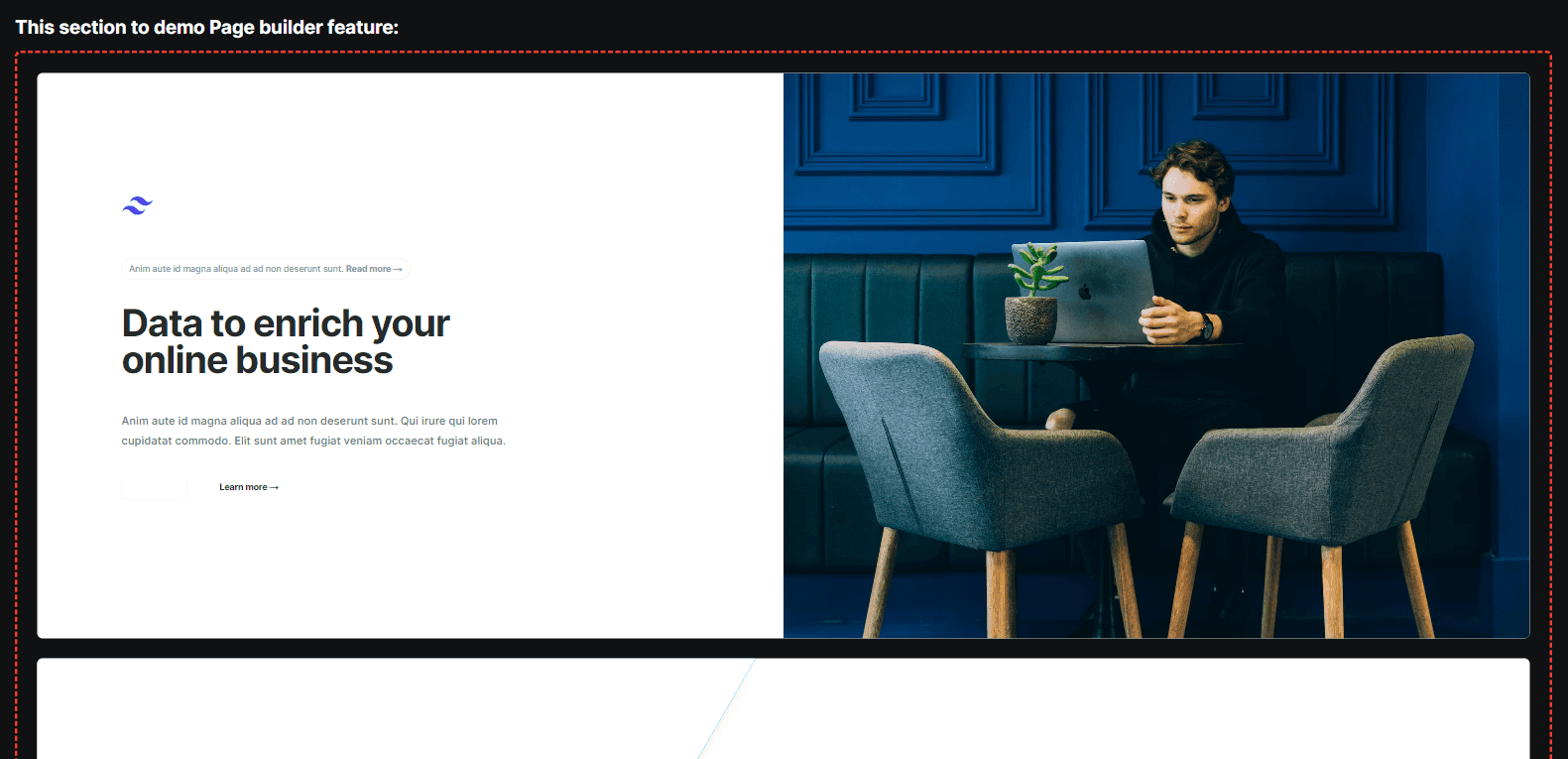
If every worked you can see the dynamic block with 3 components inside like this:
Simple, right? Ha! The ideas behind all this are really straight forward, there's just quite a number of steps involved to get setup.
It's great how customisable Sanity is but it's also incredibly verbose.
Next step:
We will build a Parent/Child Taxonomy for Sanity studio.